AMU
AMU is Montenegro's Agency for Audiovisual Media Services, the people who look after television, radio and on-demand media. When it opened a competition for a new identity, we entered with one idea: communication is a wave, and every wave starts with someone saying something. This is our proposal.
Explore the design systemServices provided
- 01Identity concept
- 02Emblem and logo, stacked and horizontal
- 03Full logo in Montenegrin and English
- 04Color palette and type system
- 05Brand guidelines
- 06Stationery, business cards and merchandise
- 07Outdoor: billboard, bus shelter, vehicle
- 08Website, social media templates and event screens
- 09Live design system with web components
A regulator's work is mostly invisible: licenses, registers, complaints, the rules that keep a signal honest. The identity had to be serious enough for a council session and clear enough for a bus shelter, without looking like a ministry. So we started with the most familiar shape in communication, the speech bubble.
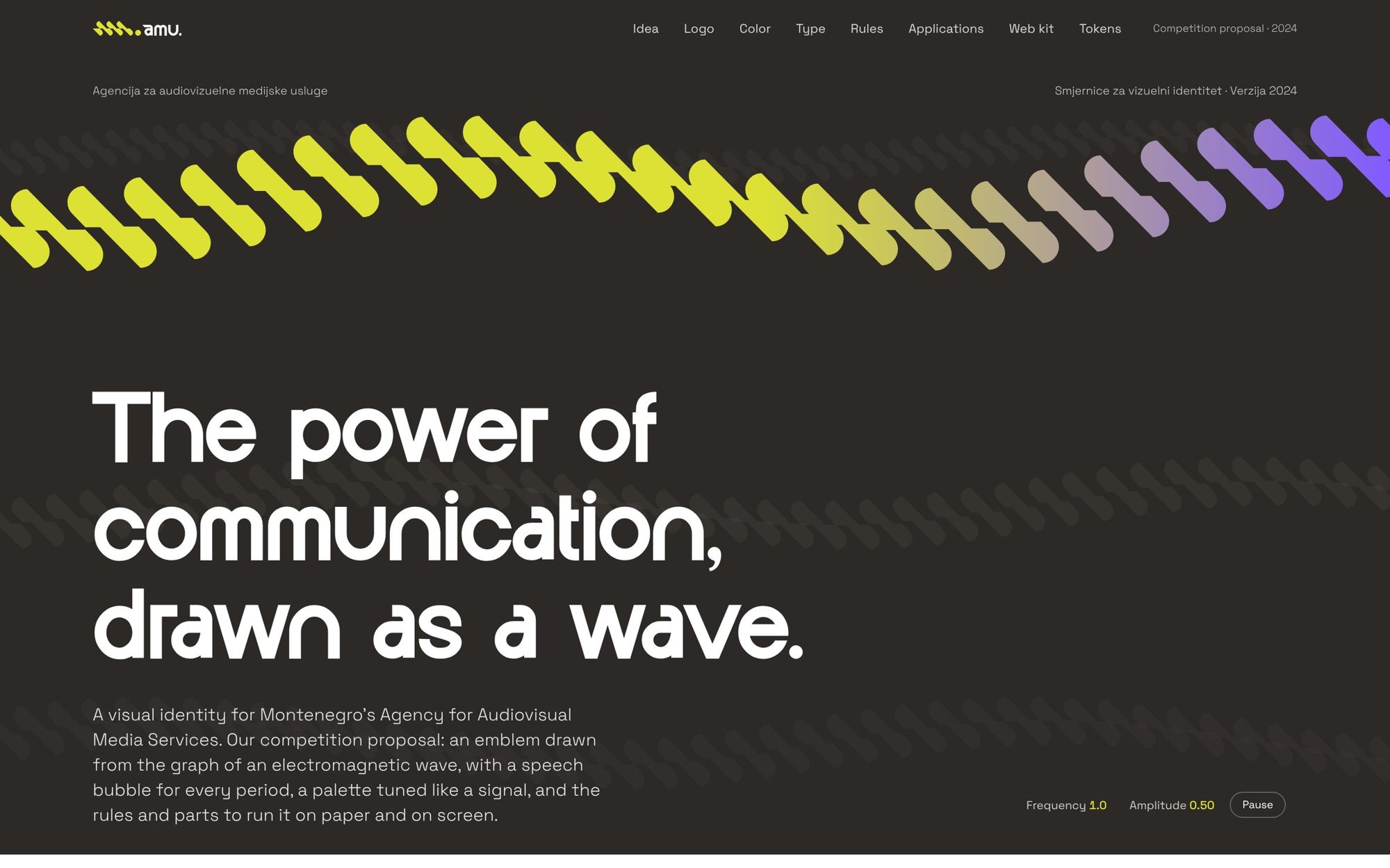
Drawn on a 45° grid, the bubble becomes one period of a wave. Repeat it three times, offset at the middle line, and the wave carries the letters A, M and U. A full stop closes the acronym. The logotype follows the emblem's rhythm, in Montenegrin and in English, and the emblem is allowed to travel alone.
The palette is tuned like a broadcast: Signal, an electric lime, and Frekvencija, a violet, with white, a quiet grey and a warm black doing the everyday work. Then we put it everywhere a regulator actually shows up, from the letterhead to the van to the conference screen. And because rules only work if people can find them, it ends in a live design system with the website parts already built.
Design system
A brand is only as good as the last person who used it.
So this proposal didn't stop at the guidelines. It comes with a live design system: the emblem as a signal you can tune, the logo builder, colors, type, rules, and the web parts an agency site is made of, ready to build.