La Botillería
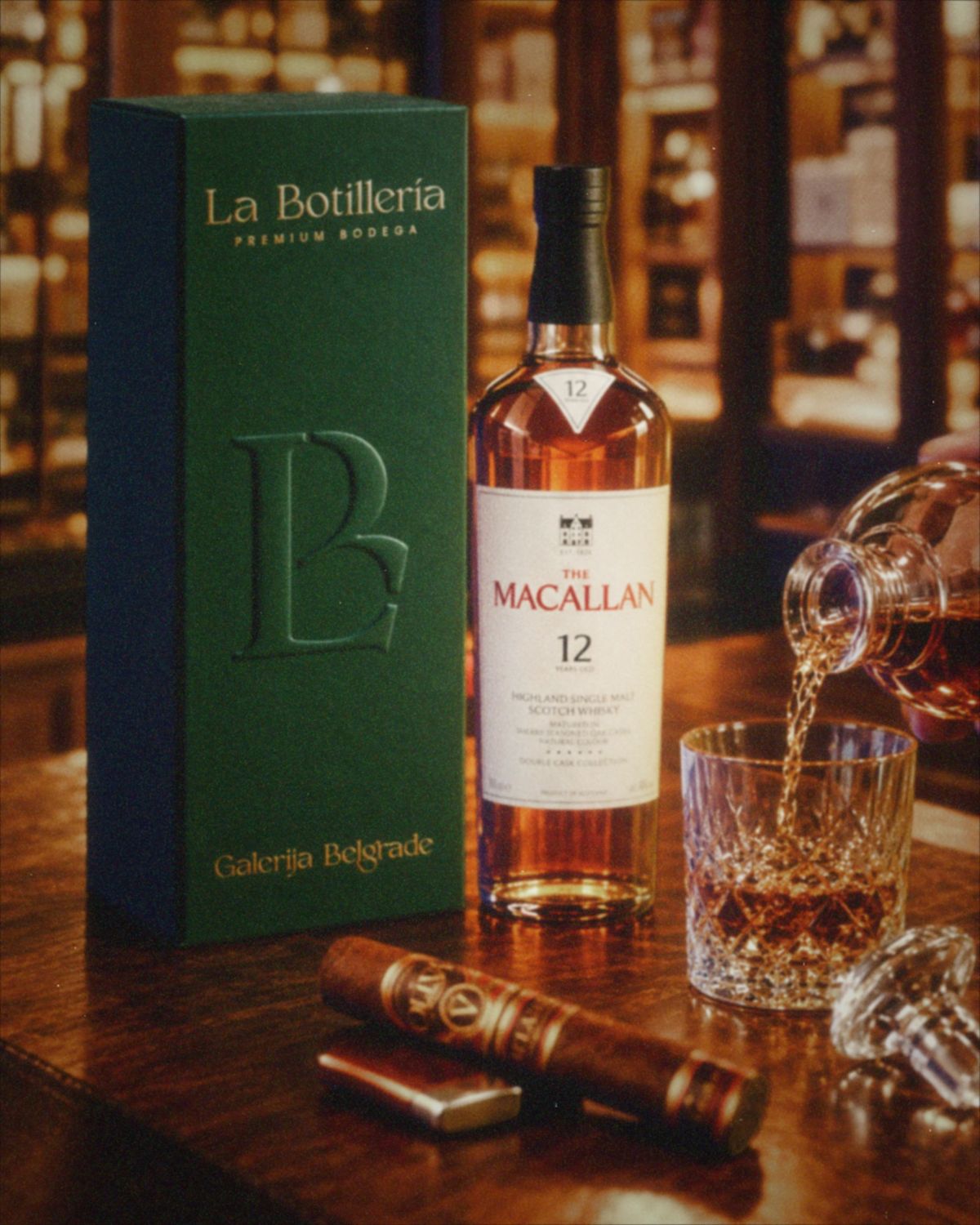
La Botillería is a premium bodega in Galerija Belgrade, the most upscale shopping address in the Balkans: rare spirits, wine, sake, fine tobacco, and a few good things to eat with them. In Chile, a botillería is the corner bottle shop. Our job was to keep the warmth of the corner and lose the corner.
Explore the design systemServices provided
- 01Visual identity
- 02Logo and LB monogram
- 03Color and type system
- 04Illustrations: grapevines, tobacco, wheat
- 05Gift box packaging
- 06Gift cards
- 07Shelf talkers and price tags
- 08Design system
A bottle shop in a shopping center has a few seconds to explain itself to people walking past with other plans. So the identity starts where the eye does: one serif wordmark, lit warm against black, with nothing competing with it. The bottles do the rest.
The letters are cut like the labels on old bottles: high contrast, sharp terminals, a little of the hand left in. The monogram folds the L into the B, so the shop can sign a box, a card or a bag with two letters. "Premium Bodega" sits underneath in wide, quiet capitals, the way a vintage sits under a name.
The colors come off the shelves: Emerald Velour, a green bottle held up to a lamp; Smoke, the anthracite of the racks; Sake, a rice-paper ivory; Whiskey, poured in small measures; and Dram, the same whiskey held to the light, which turns into gold foil in print. Each shelf has its own illustration, pressed into the paper instead of printed: grapevines for wine, tobacco leaves for cigars, wheat for whiskey. And all of it lives in one design system, so the next price tag is as considered as the gift box.
Design system
A brand is only as good as the last person who used it.
So the identity doesn't stop at the gift box. It comes with a live design system: the mark and its finishes, color, type, the three illustrations, a monogram pattern for tissue paper, a shelf-talker maker, and the web parts an online bottle shop is made of.